VW.001SHOWCASE · LIVE
Shope Financial
Independent RIA, Ann Arbor. Editorial cream palette, the firm’s own Bedrock System as the spine of the site, shipped in days, not months.
RIA · 23 YRS · EDITORIALLive ↗
A boutique web studio for independent advisors. Custom design, custom copy, custom voice — replacing the template platforms that made every RIA site look exactly like every other RIA site.
These are not screenshots from one website with a different logo. These are six different independent advisors, all on Twenty Over Ten or FMG Suite, all picking the same hero image, the same gold serif headline, the same three circle icons.
The template platforms have flattened the industry. A prospect reaching three advisor websites in a row cannot tell them apart. That is the problem we exist to solve.
If your site looks like one of these, send it over — you’ll get an honest review before we ever talk.
Every project starts from positioning, not Pinterest. One live showcase and three spec concepts — fictional firms, real process — built to show range across very different kinds of RIAs.
Independent RIA, Ann Arbor. Editorial cream palette, the firm’s own Bedrock System as the spine of the site, shipped in days, not months.
Second-generation Boston firm for retirees and their adult children. Serif display, warm paper, the institutional voice they actually had.
A two-partner, fee-only firm for the five years before retirement and the thirty that follow.
Schedule a call →Fee-only retirement-income firm for the decade before, and the three after. Bright modern layout with the actual planning math up front.
Modern, friendly retirement planning for people who built it themselves. Bold evergreen palette, rounded cards, and a warm approachable voice, a deliberate break from the buttoned-up advisory look.
Each of these began as a single experimental landing page — one metaphor pushed as far as it would go — then was rebuilt as a complete five-page site with the same world intact. Both stages are here: the concept, and the site it became.
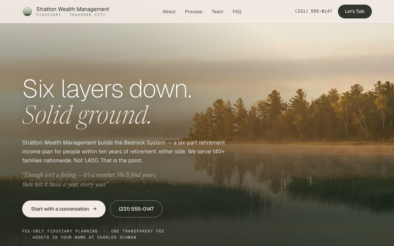
A six-layer geological descent for a retirement-income firm — the ground solidifies as the plan completes, ending at bedrock: two reviews a year, every year.
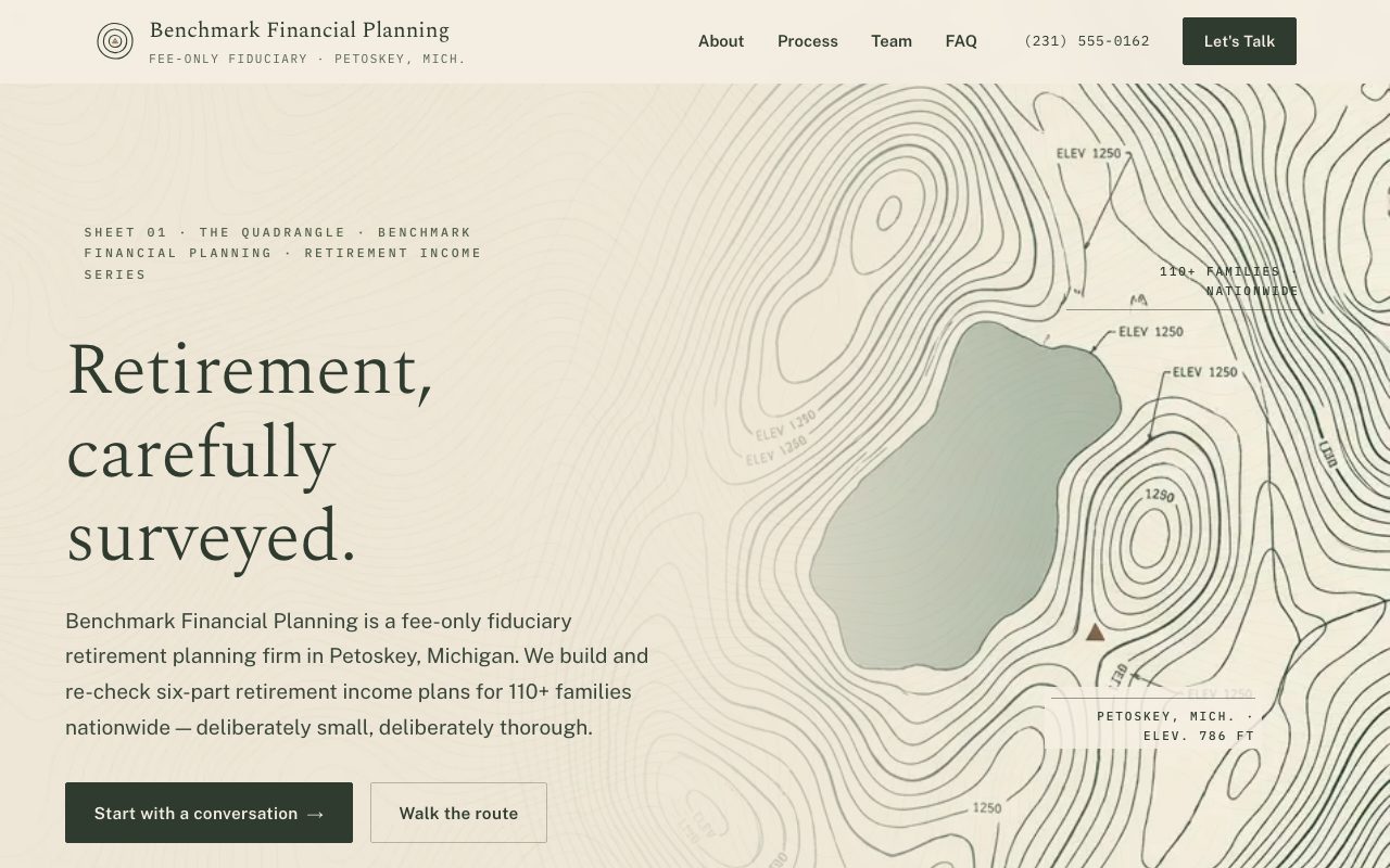
A surveyor’s quadrangle drawn as a website — six stations on one route, hairline contours, and the client as the fixed datum point everything is measured from.
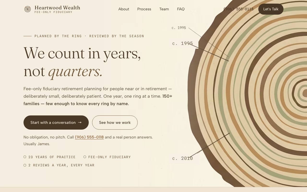
One ring per year, two review notches per ring — a 23-ring cross-section that grows as you read, from first conversation to still answering the phone.
No account managers. No junior designers. No offshore handoff. Parker runs every project, end to end.
Custom is not always the right answer. A solo practice doing $300k in revenue will be served fine by a template. Here is who we are actually built for.
No quote calls and no “contact us for pricing.” One flat founding-client rate — scope only grows if you add pages, illustration, or a brand refresh alongside the site.
$2,500 flat. Half upfront, half on launch. No monthly contract. Limited to the first five firms. Includes positioning, design, copy, build, and six months of post-launch support.
No deck. No questionnaire. No pressure. Or skip the call entirely — send your site and you’ll get an honest review back: what’s working, what it’s costing you, and what we’d change first.